

The Activity Summary is the report to open first. It answers "how are we doing" in one screen, before you go looking at any particular tracker or channel.
It's also the landing page when you press Reports in the navigation bar.
The Report
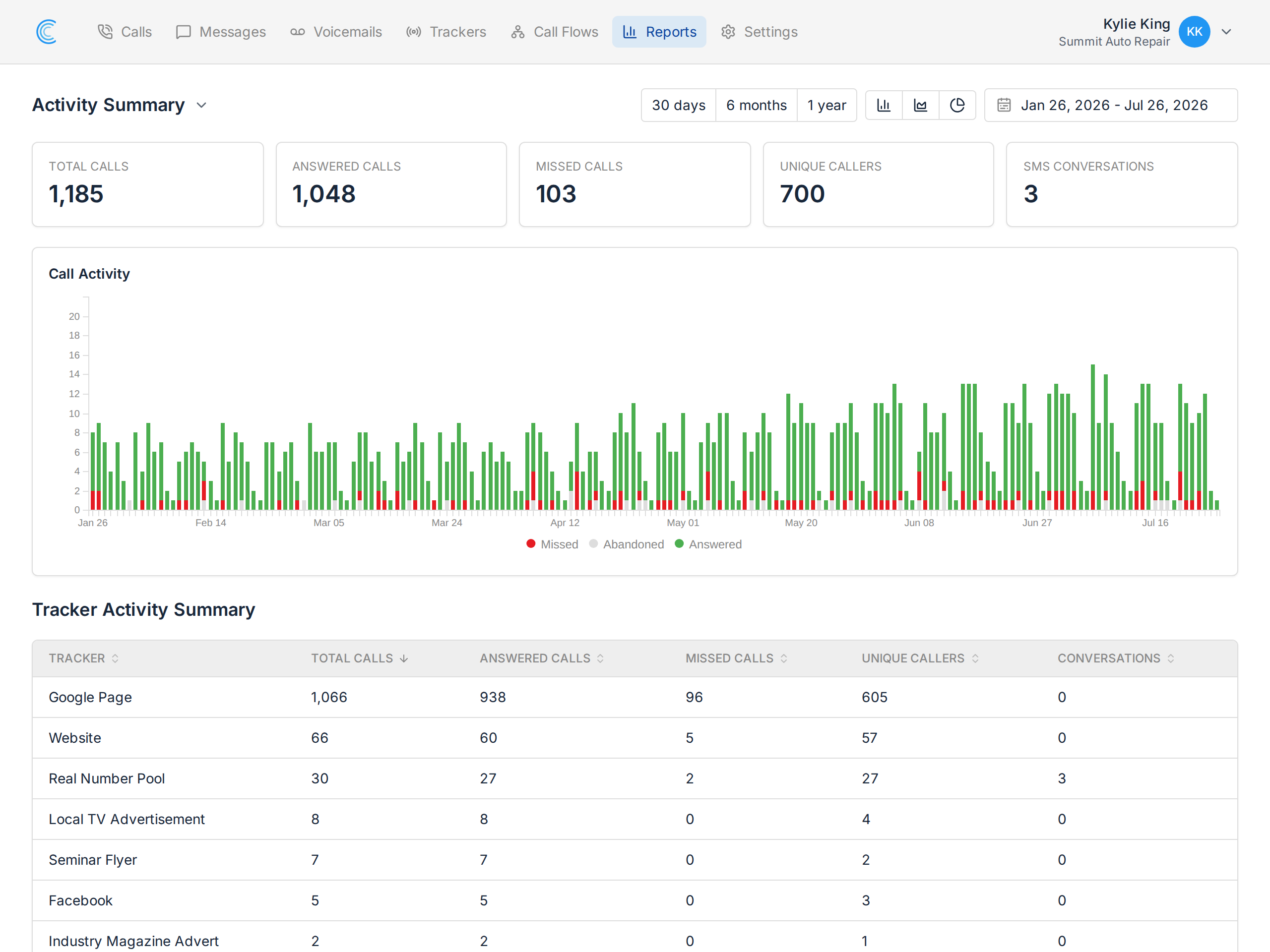
Across the top:
- Total Calls — every call in the period.
- Answered Calls — calls someone picked up.
- Missed Calls — calls that rang out.
- Unique Callers — how many different people called, so repeat callers don't inflate the picture.
- SMS Conversations — message threads over the same period.
Call Activity Over Time
The chart plots calls per day, split by outcome: answered in green, missed in red, abandoned in grey.
The shape is what matters. A steady green band with occasional red is healthy. A block of red on particular days usually means nobody was covering the phone — a lunch hour, a Saturday, a week someone was away. Cross-check it against the Calls by Time of Day heatmap to see whether the pattern repeats every week.
The Breakdown by Tracker
Below the chart, the same figures are broken down per tracker: total calls, answered, missed, unique callers and conversations.
This is where an overview becomes actionable. A missed-call rate that looks acceptable overall often hides one tracker doing badly — a campaign pointing at a number nobody covers, or a call flow with too short a ring time. Sort by missed calls and it stands out immediately.
Changing the Period
Use 30 days, 6 months or 1 year for a quick range, or the date picker for exact dates. Comparing the same range month to month is the simplest way to see whether marketing changes are producing more calls.
Where to Go Next
The Activity Summary tells you that something changed. The other reports tell you why.
Call reports
- Calls by Tracker — which campaign or number moved.
- Calls by Source Channel — which channel produced the calls: organic, paid, referral, direct.
- Calls by Keyword — which search terms convert to phone calls.
- Calls by Tag — what the calls were about, using your own tags.
- Calls by Value — what the calls were worth.
- Calls by Time of Day — when your phone rings, and when nobody is covering it.
Message reports
- Messages by Tracker — SMS volume per tracking number.
- Messages by Tag — what your SMS conversations are about.
By email
- Email Summary Reports — have this summary delivered daily, weekly or monthly instead of signing in for it.